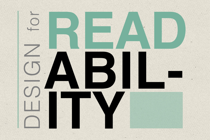
Having trouble reading things on the web? Wonder if it’s your eyesight? It’s not. The tech world is failing you.
The internet is becoming unreadable because of a trend towards lighter, thinner fonts – fonts that don’t meet the basic standards of readability for a good share of the populace.
 The Telegraph of London reports that a web expert has found these lighter, thinner fonts are making it difficult for the elderly or visually-impaired to see words clearly. Where text used to be bold and dark, which contrasted well with predominantly white backgrounds, now many websites are switching to light greys or blues for their type.
Award winning blogger Kevin Marks, founder of Microformats and former vice president of web services at BT, decided to look into the trend after becoming concerned that his eyesight was failing because he was increasingly struggling to read on screen text. He found a ‘widespread movement’ to reduce the contrast between the words and the background, with tech giants Apple, Google and Twitter all altering their typography.
True black on white text has a contrast ratio of 21:1 – the maximum which can be achieved. Most technology companies agree that it is good practice for type to be a minimum of 7:1 so that the visually-impaired can still see text. Yet Marks found that even Apple’s own typography guidelines, which recommended 7:1 are written in a contrast ratio of 5.5:1. Google’s guidelines also suggest a 7:1 contrast ratio, but 54 per cent opacity of display, which brings the ratio down to 4.6:1.
Marks, who has been named one of the Telegraph’s 50 must influential Britons in technology, said the changes risk undermining the universal reach of the internet. “The typography choices of companies like Apple and Google set the default design of the web, and these two drivers of design are already dancing on the boundaries of legibility,” he warned on the technology site Backchannel. “If the web is relayed through text that’s difficult to read, it curtails the open access by excluding large swaths of people such as the elderly, the visually impaired or those retrieving websites through low quality screens.”
The changes in typography have come about because, as web design evolved, the numbers of fonts, colors and background began to diverge from the original set of ‘web safe’ fonts which were deemed legible online.
The rise in LCD technology and high definition screens has also allowed designers to use increasingly thinner fonts. While these fonts work on desktops, they can be virtually impossible to read on smartphones or tablets.
In recent years, reference guides have steered designers away from too much contrast, claiming that traditional black on white typography strains the eyes, and made it difficult for people with dyslexia. Many computers are now set to grow dimmer during the evening to avoid too much blue light after dark, which can keep people awake.
But the US based Web Accessibility Initiative, which came up with the original ratio formula in 2008 to help web designers said too little contrast made web pages “confusing and frustrating”. “Choosing colors with poor contrast makes navigating, reading and interacting a real pain,” said a spokesman. Sufficient contrast between foreground and background colors is essential for people with low contrast sensitivity which becomes more common as we age.
Marks said reducing the contrast risked alienating some users. “To arbitrarily throw away contrast based on a fashion that looks good on my perfect screen in my perfectly lit office is abdicating designer’s responsibilities to the very people for whom they are designing,” he said. “My plea to designers and software engineers: Ignore the fads and go back to the typographic principles of print. “You’ll be making things better for people who read on smaller, dimmer screens, even if their eyes aren’t aging like mine. It may not be trendy, but it’s time to consider who is being left out by the web’s aesthetic.”